LinkedIn Recruiters Over Time
Updated Sun 2021-05-30 | 700 words
- Build your own chart
- Add custom annotations
- Other things I want to know
- Other ways to process CSV files
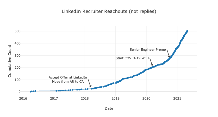
I try to reply to every message I get on LinkedIn, and, every week, it seems like more messages appear. Recently, I downloaded all messages every sent from my Member Data Page and used SQLite to poke around the data. I ended up building the following chart of the reachouts (ignoring replies) over time and annotating significant career events
Build your own chart
I'm sure many people can create far more interesting charts than mine. Here's how to chart your own LinkedIn messages over time.
- Make sure you have Python3 and SQLite3 installed to create the chart. They'll need to be accessible from your terminal. On MacOS, I installed recent versions from Homebrew with
brew install python3 sqlite. You'll also need a browser to view the chart. - Download your messages from your Member Data Page, this SQL Script to aggregate the data, and this Python Script to create the chart. Put all of these (
messages.csv,aggregate_reachouts.sql, andchart.py) into the same directory.
- Aggregate the data on the terminal:
sqlite3 messages.db '.read aggregate_reachouts.sql'. This will create a SQLite3 database (messages.db) to explore later and a TSV file (aggregated_reachouts.tsv) we'll turn into a chart. - Plot your reachouts over time! The following command works great on MacOS, but on Windows you'll probably need to scrunch all the lines together into one line and remove the
\characters.
python3 ./chart.py \
    --firstline \
    --title "LinkedIn Recruiter Reachouts (not replies)" \
    --output aggregated_reachouts.html \
    --xaxis_title Date \
    --yaxis_title "Cumulative Count" \
    ./aggregated_reachouts.tsv \
timechart- Open aggregated_reachouts.html in your browser. On the first load, the browser needs to download the marvelous Plotly.js library so loading will take a few seconds. If you decide to post your reachout chart on LinkedIn, please send me a message or tag me (@Benjamin Kane) so I can check out your graph too.
Add custom annotations
If you recall dates you'd like to annotate on your chart, you'll need to take a few more steps:
- First, change the chart command to output JSON instead of HTML:
python3 ./chart.py \
    --firstline \
    --title "LinkedIn Recruiter Reachouts (not replies)" \
    --output aggregated_reachouts.json \
    --xaxis_title Date \
    --yaxis_title "Cumulative Count" \
    ./aggregated_reachouts.tsv \
timechart- Open that JSON file in a text editor and add your custom annotations under the
"layout"key. Use the Plotly JavaScript docs for reference. For example, my JSON looks like the following:
{
  "data": [ "TODO" ],
  "layout": {
    "annotations": [
      {
        "text": "Accept Offer at LinkedIn<br>Move from AR to CA",
        "showarrow": true,
        "x": "2018-03-12",
        "y": 40,
        "xanchor": "right"
      },
      {
        "text": "Start COVID-19 WFH",
        "showarrow": true,
        "x": "2020-03-12",
        "y": 215,
        "xanchor": "right"
      },
      {
        "text": "Senior Engineer Promo",
        "showarrow": true,
        "x": "2020-10-01",
        "y": 285,
        "xanchor": "right"
      }
    ],
    "title": "LinkedIn Recruiter Reachouts (not replies)",
    "xaxis": {
      "title": "Date"
    },
    "yaxis": {
      "title": "Cumulative Count"
    }
  }
}- Finally, turn the JSON into HTML with this script and re-open the browser:
plotly_json_to_html.py -o aggregated_reachouts_annotated.html aggregated_reachouts.jsonOther things I want to know
Of course, now that all messages are in a database, it's possible to run other SQL queries to find other information. For interactively working with SQL, the sqlite3 shell is a little bare-boned. I prefer litecli(here's the config I use for it) or Beekeeper Studio. They both offer autocomplete and nice colors
How many messages are there?
SELECT COUNT(*) FROM messages;I've received and replied 2236 messages! This is also a good check to ensure I read from the spreadsheet correctly- it also has 2236 rows.
Who sends the most messages?
SELECT
  [FROM],
  COUNT(*)
FROM
  messages
GROUP BY
  [FROM]
ORDER BY
  COUNT(*) DESC;
I send the most messages (976), followed by "LinkedIn Member" (129), an empty name (74), then some friends and colleagues. The most talkative recruiter I don't know outside of LinkedIn sent 9 messages.
What's the timespan of all these messages?
SELECT
  MIN(sqlite_date),
  MAX(sqlite_date)
FROM
  messages;
The first message was sent in March 2016, and the last one was sent yesterday (April 2021). This is also visible from the chart of course.
Get some stats by recruiter name
SELECT
  [FROM] as recruiter,
  MIN(sqlite_date) AS first_message_date,
  SUM(COUNT([FROM])) OVER (PARTITION BY [FROM]) AS total_messages,
  ROW_NUMBER() OVER (
    ORDER BY
      sqlite_date
  ) AS running_count
FROM
  messages
GROUP BY
  [FROM]
ORDER BY
  sqlite_date ASC;
I had to learn more about analytic functions for this query - the following links helped:
- SQL: How To Select Earliest Row
- How to use ROW_NUMBER in sqlite
- Analytic function concepts in Standard SQL
Other ways to process CSV files
Of course, SQLite3 is but one of many ways to query CSV files. I chose it because I wanted to practice/learn more SQL and I didn't want to deal with installing Pandas/Jupyter Notebook. Other ways include Pandas, pure Python code, and Excel/Google Sheets.